
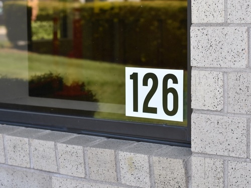
Schools are taking security more seriously than ever, with measures that address both prevention and response. One such measure is clear identification of every room in the school building. School room identification numbers help first responders quickly understand where a threat may be located when they arrive on the scene.
As a sign and safety company that has helped many schools with their room identification systems, we’ve learned what works and what does not. This guide covers four key factors—placement, letter height, color, and font—to help you create an effective room identification system and avoid common mistakes.
Room Number Placement: Inside vs. Outside the Glass
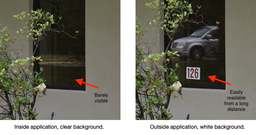
The placement of your school room identification stickers is probably the most important factor in how easily they can be read. Adhesive-faced stickers applied to the inside of the glass can be difficult to read because of window glare or tinted glass.
To illustrate this, we tested adhesive-faced stickers placed on the inside of the glass against adhesive-backed stickers placed on the outside. We photographed the results from the same distance and angle.
In our comparison, the sticker placed inside the glass is barely visible, while the sticker placed outside is easily readable from a long distance.
Letter Height and Viewing Distance
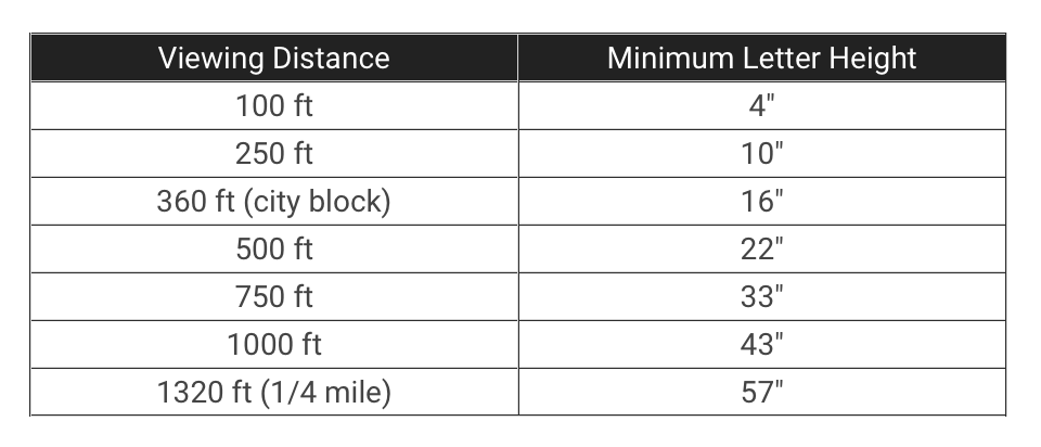
Letter height directly affects how far away a room ID can be read. We recommend a letter height of 4 inches, which should make the room ID readable from up to 100 feet away. This relationship is illustrated in the letter visibility chart developed by the Pennsylvania Transportation Institute, Penn State University and the United States Sign Council.
Room Number Color and Contrast
Along with the height of the numbers, a high contrast color scheme is critical for maximum readability. We recommend black letters on a solid white background. Without the white background, the letters tend to disappear into the glass when viewed from a distance. The comparison photo above shows an example.
Font Selection for Readable Room Numbers
For room identification numbers, we recommend a simple sans-serif font such as Helvetica or Arial because these fonts are clean and easy to read. More decorative fonts and serif fonts such as Times Roman are more difficult to read as viewing distance increases.
Room Identification Questions & Ordering
If you have questions about school room identification numbers, contact us or call us at 631-242-2828.
To place an order, visit our room identification numbers product page.